One of the projects I'm working on is Thunor, which is a web application and software platform I've developed for high throughput cell proliferation data. The video at the top of the page gives a 3-minute primer, but for those who would appreciate some background from a generalist perspective (Hi Dad!), I thought I'd write a quick post on the key features of the software.
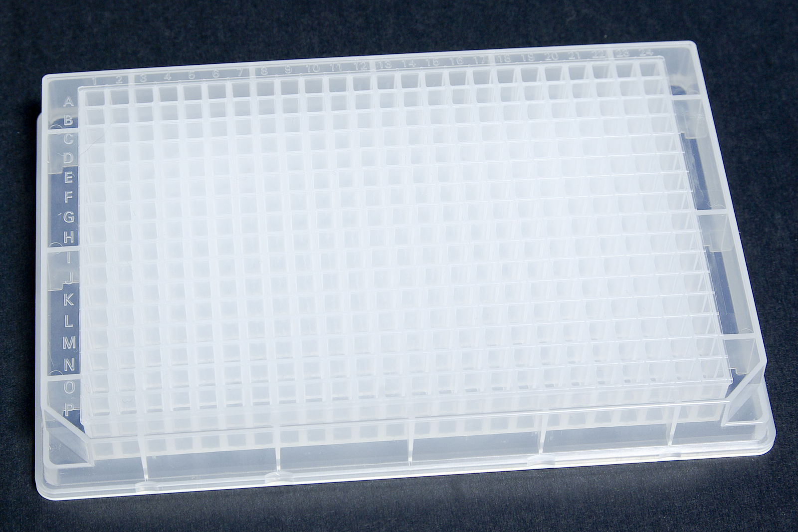
High throughput screens (HTS) essentially try a set of drugs on a set of cultured cell lines (lab-grown human cells in this case, which are drawn from different tissues and serve as a proxy for various cancer types). Multi-well plates make this scalable: each well acts like a separate Petri dish for growing cells, and each plate typically has 96, 384 or 1536 wells. Robotic platforms help to keep the cells incubated, and can handle a "library" of multiple plates by placing them under a microscope with a camera, one at a time, at regular intervals. Each well is photographed separately, and computational image analysis automatically counts the cells in each image.
 Example of a 384 well plate from Wikipedia. Licence: CC BY-SA 3.0. Image is unaltered from original.
The cells grow over the course of a few days, and hopefully the ones treated with a drug grow more slowly, or die out. Then it usually falls either to some proprietary software, or to a set of custom-written scripts (computer programs, often written in R in this case), to fit dose-response curves, visualise the results and calculate statistics. This process is usually either expensive and opaque (proprietary software) or difficult, time-consuming, error prone, and requires specific skills (writing scripts).
Thunor brings a few new capabilities to the table.
Simple Data Management
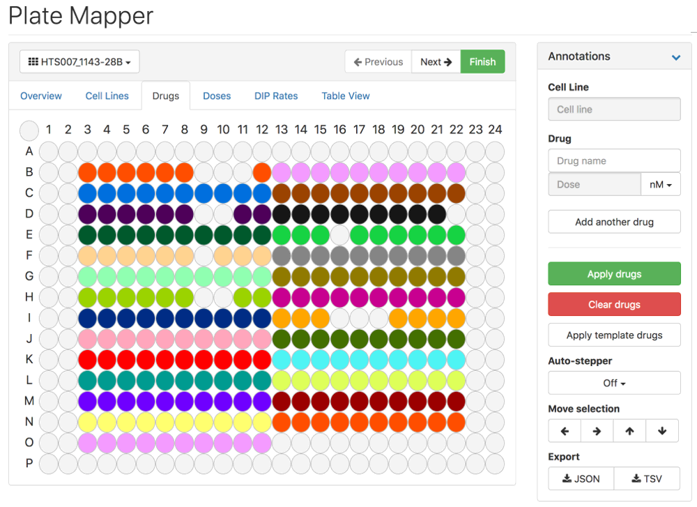
There were't really any widely accepted data formats or systems for storing and exchanging HTS data before now. Thunor stores these data in a relational database and adds a web interface with an authentication layer. Data are uploaded by drag-and-drop, and the plate layouts can be specified using a graphical interface (by layout, I mean which drugs and cells are where in each plate, bearing in mind datasets can have hundreds of plates). Dose-response curves are fitted automatically.
 Thunor Web's Plate Mapper. Click image to try the demo. Licence: CC BY-SA 3.0
Dynamic response calculation
Drug response was traditionally calculated at a single time point: the end of the experiment. The number of cells surviving in drug-treated wells is compared to the number of cells not exposed to drug (the control) to give a percentage viability. Recent work by the Quaranta lab showed that this can lead to flawed results, and they proposed an alternative metric, the drug-induced proliferation (DIP) rate, which measures the drug response dynamically. With the falling experimental cost of generating multi-time point data, the main barrier is the lack of software to calculate dynamic drug response easily and at scale. Thunor does this automatically, including detecting any delay in drug effect.
Example of a DIP rate fit (straight lines) to experimental data (dot-dashed line). Click image to try the demo (double-click on any drug concentration in the legend to show only that trace; double-click the background
to auto-scale the axes). Licence: CC BY-SA 3.0
Interactive graphical analysis
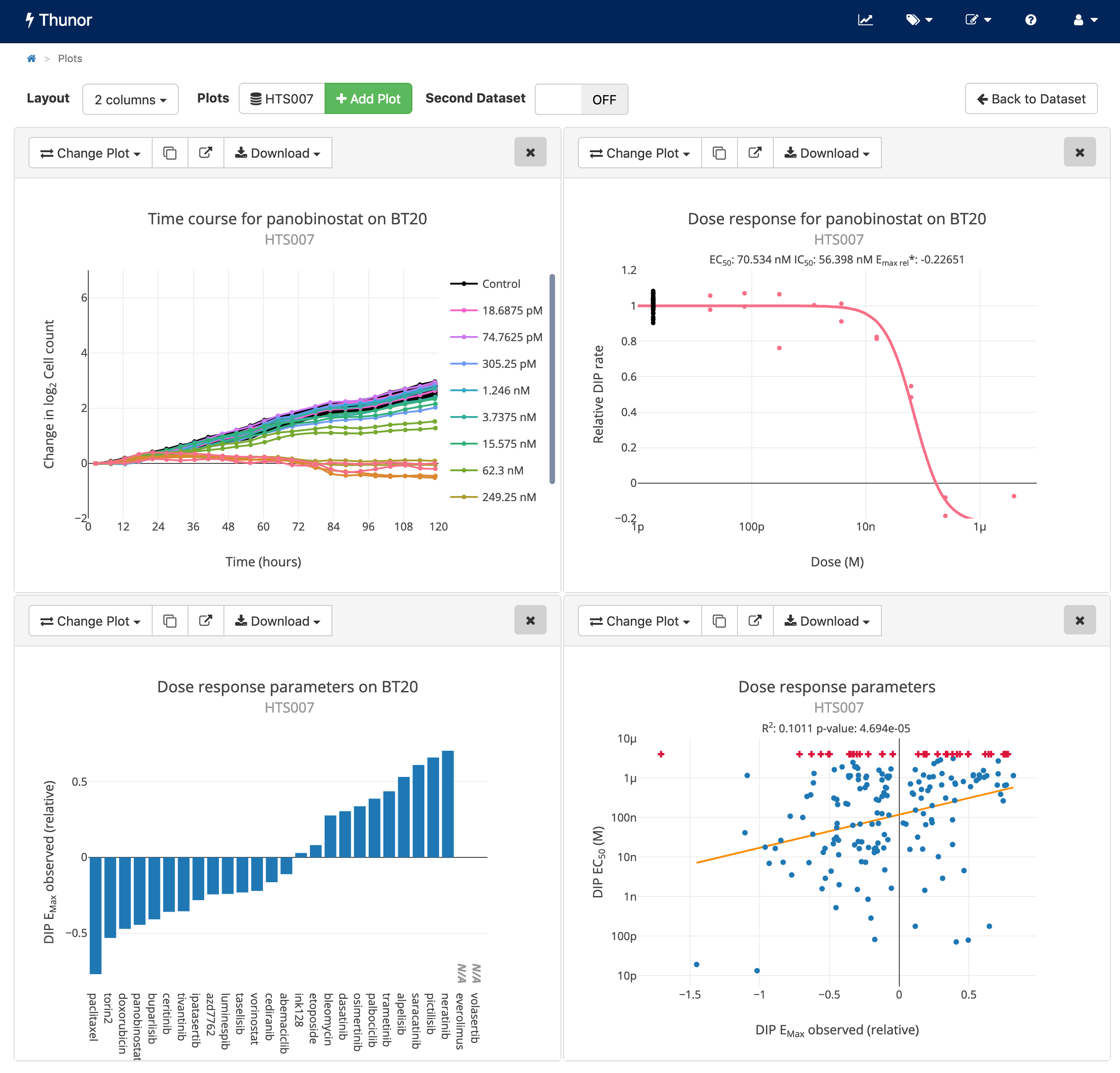
Thunor Web has lots of different interactive visualizations, including time
courses, dose-response curves, dose-response parameter scatter/bar/box plots, and quality control views. I won't
go through it all here, since it's all documented in the manual, but here's an example graphic:
 Example interactive plots from Thunor Web. Click image to try the demo. Licence: CC BY-SA 3.0
Data selection and aggregation by tags
Within larger datasets, we often want to look for effects and test hypotheses between groups of cell lines or drugs. "Does this drug affect cell lines with mutations in the BRAF gene more strongly?", or "Which EGFR inhibitor (drugs which inhibit the effect of a particular growth factor) is most effective on skin cancer cell lines?". Thunor lets you define tags to group cell lines or drugs as you see fit (by cell lines' genetic mutation, drugs' molecular target or or target pathway, or anything else) using a graphical tag editor or by uploading a spreadsheet. You can then use tags for selecting cell lines or drugs, or aggregating them into a group (a box plot). Hopefully you can imagine the power this gives you to do unlimited hypothesis exploration without leaving the graphical interface, by defining and refining groups of cell lines and drugs that reflect biology or biochemistry of interest.
Correlation between drug potency (IC50) and efficacy (Emax observed) of PI3K inhibitors vs
"everything else" (i.e. every other drug in the dataset). Click image to try the demo. Licence: CC BY-SA 3.0
It's free and open source
This one's pretty straightforward. Everyone loves free stuff, right?
Further resources
If you're interested, we currently have a pre-print on Biorxiv, and you could also check out the following resources:
Thanks for reading!